It's a Food Idea
It's an App where users grab ideas just like grab capsules from a Gashapon!
Compared with 2D graphics, 3D is visually more appealing and realistic, and on an user interface, 3D elements could trigger people’s desire to interact with the buttons. However, it could be distracting if not appropriately applied.
For this project, I’m planning to build a simple mobile App for people who need inspirations for dinner. The app will look like a toy-version bubble gum machine(Gashapon) and mainly contain two functions: upload images of your diner or randomly get a image of another user’s diner with some texts such as dish’s name.

Target Users:
-
People who care about what they eat and often think about what to eat for lunch/dinner
-
People who would love to share about what they eat
Journey Map:

When I was creating the journey map, I noticed that users often thinking about what to eat in 3 different scenarios:
-
Cooking at home
-
Ordering food for delivery
-
Go to restaurant with friends/dates
And I also notice that people usually know what they DON'T want to eat, but just need some inspirations for a specific dish. As a result, I decided to add filters as one of the main function, and let users choose a scenario before they grab capsules.
Wireframe & Clickstream:
Home page

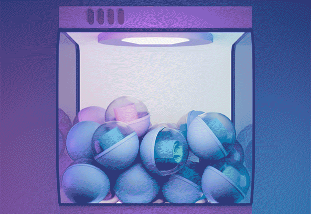
Machine


Moodboard:
In order to not make my 3D UI element distracting, I decided to make the App playful and useful. I chose purple as main color, since it presents a mysterious feeling; it can also associate with universe and relate to my App's main purpose: exchange food ideas with strangers from the world.

Modeling&Texturing:
After having all the ideas and decisions, I started building machines in Cinema4D, since the machine page has the most animations and functions.


Animation:
The most challenging animation in this project is to make capsules shuffling in the machine, which is to let them spin. This dynamic is very important since it makes the App more visually appealing and immersive.
Iterations:
One of the adjustments I made during the process is the style of button. Originally, I put the button in the same scene with the machine; however, the perspective of buttons didn't fit; texts won't be clear enough. Plus, the button, which is interactive, is not different enough from the machine. In order to prevent users be confused, I changed the style to let buttons be more obvious.
Original button

New button

Pressed State

Regular State

For the home page. My first idea was to use a model of classic Gashapon, texturing with 3 different color and create 3 illustrations to put on the right side of banner. Yet, each banner presents a specific scenario, therefore, I decided to use models which remind users of real life: a cooking pot for home-made dishes, a scooter for delivery, and a house for restaurant. I rendered all of them with the same lighting in Cinema4D to match the style.

In addition, on the bottom of this page, there are a "Share" button for users to share the App, an "Upload" button for users to upload their own images of dishes, and a "Collection" button where displays all the images a user saves.
The last part where I used 3D elements was the card on which the image of dish is displayed.
On this page, I added "Save" and "Grab again" button, because it is likely that users will get inspirations after grabbing several times, and the clickstream would be simpler if user can re-grab from this page.

One of the common questions during my process was that: why purple instead of orange or red, which is more related to food?
As a result, I changed theme color for other two scenarios, so that the UI for each scenario page will have a corresponding color.

Final video showing the clickstream of grabbing and saving: